

Force-Directed Graph Layout Tutorial in Python
- Sep 14, 2025
- 6 min read
Force-directed graph layouts are one of the most popular techniques for visualizing complex networks. They simulate physical forces—where nodes repel each other and edges act like springs—resulting in an intuitive and visually appealing structure. In this tutorial, we’ll explore how to create force-directed graph layouts in Python using libraries like NetworkX and Matplotlib, making it easier to understand relationships, clusters, and patterns within your data.

Introduction to Force-Directed Graph Layouts in Python
Force-directed graph layouts are a powerful way to visualize complex networks in Python. Unlike standard graph layouts, force-directed layouts use physics-inspired algorithms to position nodes in a way that reveals relationships and clusters naturally. In these layouts, nodes repel each other, while edges act like springs, creating an intuitive structure where connected nodes are closer together and unrelated nodes are farther apart.
Python makes creating force-directed graphs straightforward with libraries like NetworkX, Matplotlib, and Plotly. These tools allow data scientists, developers, and researchers to visualize social networks, knowledge graphs, and other relational datasets effectively. In this tutorial, you will learn how to set up your Python environment, build a graph, apply force-directed layouts, and create both static and interactive visualizations.
Real-World Applications of Force-Directed Graphs in Python
Force-directed graphs are not just theoretical—they are widely used in practical scenarios where understanding relationships and structures is crucial. Python’s visualization libraries make it easy to apply these layouts to real-world data. Some common applications include:
Social Network Analysis
Force-directed graphs are ideal for visualizing social networks, such as connections between users on social media platforms. They help identify communities, influential nodes, and patterns of interaction, making it easier to analyze networks at both small and large scales.
Knowledge and Concept Maps
In education and research, force-directed layouts can illustrate knowledge graphs or concept maps. Nodes represent concepts, and edges show relationships, helping learners or researchers quickly understand complex systems of information.
Biological, Chemical, and Data Relationship Networks
Force-directed graphs are valuable in scientific research, including biology and chemistry. For example, they can visualize protein-protein interaction networks, gene regulatory networks, or molecular structures. In data analytics, they can reveal hidden relationships between variables in datasets.
How Force-Directed Graphs Work: Principles and Algorithms
Force-directed graphs are based on a physics-inspired approach to network visualization. The layout algorithm treats nodes and edges like physical objects, simulating forces to position them in a visually meaningful way.
Nodes Repelling and Edges Acting Like Springs
In a force-directed layout, nodes repel each other, similar to charged particles, to prevent overlap and maintain spacing. Meanwhile, edges act like springs, pulling connected nodes closer together. The algorithm iteratively adjusts node positions until the system reaches a stable state, resulting in a graph where relationships are visually intuitive.
The Physics Behind Force-Directed Layouts
The underlying principle is to minimize energy in the system. Each node experiences forces from other nodes and connected edges, and the algorithm updates positions to reduce “stress” or potential energy. Popular algorithms include the Fruchterman-Reingold and Kamada-Kawai methods, both widely used in Python libraries like NetworkX.
Advantages compared to other graph layout types
Intuitive Visualization: Clusters and communities naturally form, making patterns easier to see.
Flexible: Works for graphs of varying sizes and structures.
Dynamic: Can adapt to changes in the network without manually repositioning nodes.
Understanding these principles helps you use Python’s tools more effectively, allowing for clearer and more informative network visualizations.
Setting Up Python for Force-Directed Graph Visualization
Before building force-directed graphs in Python, you need the right libraries and a clean environment to work in.
Installing networkx, matplotlib, and plotly
The three most commonly used libraries for graph visualization in Python are:
NetworkX → for creating and managing graph structures
Matplotlib → for static graph visualization
Plotly → for interactive graph visualization
You can install them using pip:
pip install networkx matplotlib plotlyUsing Virtual Environments for Python Projects
It’s a good practice to create a virtual environment to keep your project dependencies isolated:
python -m venv graph_env
source graph_env/bin/activate   # On macOS/Linux
graph_env\Scripts\activate      # On Windows
Then install your libraries inside this environment. This ensures your force-directed graph project doesn’t interfere with other Python setups.
Preparing Your Dataset for Graph Visualization
Force-directed layouts can work with any relational dataset. Your data should describe:
Nodes: entities such as people, products, or proteins
Edges: relationships or connections between them
For example, in a social network, nodes can represent people, and edges can represent friendships.
import networkx as nx
import matplotlib.pyplot as plt

# Create a graph object
G = nx.Graph()

# Add nodes (people in a social network)
G.add_nodes_from(["Alice", "Bob", "Charlie", "Diana"])

# Add edges (friendship connections)
G.add_edges_from([
    ("Alice", "Bob"),
    ("Alice", "Charlie"),
    ("Bob", "Diana"),
    ("Charlie", "Diana")
])
Here, each person is represented as a node, and their friendships are edges connecting them.
# Draw the graph without applying a force-directed layout
nx.draw(G, with_labels=True, node_color="lightblue", node_size=1500, font_size=12)
plt.show()
This creates a basic network visualization, but the positions are random. In the next section, we’ll apply a force-directed layout to make the visualization more meaningful.
Output:

Implementing Force-Directed Layouts in Python
Now that you’ve built a simple graph, let’s enhance it using a force-directed layout. This is where the visualization becomes powerful — instead of placing nodes randomly, Python’s NetworkX uses the spring_layout() function to arrange nodes based on simulated physical forces.
Using NetworkX’s spring_layout() for Force-Directed Graphs
The spring_layout() function is the most commonly used force-directed algorithm in NetworkX. It positions nodes so that connected ones are closer together while keeping the overall graph spread out.
Here’s how you can apply it:
# Apply force-directed layout
pos = nx.spring_layout(G)

# Draw the graph with the calculated positions
nx.draw(G, pos, with_labels=True, node_color="lightgreen",
        node_size=1500, font_size=12, edge_color="gray")

plt.show()
Output:

In this example:
pos stores the calculated positions of nodes.
Nodes are placed in positions that reflect their relationships.
Connected nodes (e.g., Alice and Bob) appear closer together.
Customizing Layout Parameters (k, iterations, seed)
The spring_layout() function has several parameters that control the look of your graph:
k → Optimal distance between nodes. Smaller values make nodes cluster tighter; larger values spread them apart.
iterations → How many times the algorithm adjusts node positions. More iterations = more stable layout.
seed → Ensures reproducibility so that the graph looks the same every time you run it.
Example with customization:
# Customizing the spring layout
pos = nx.spring_layout(G, k=0.5, iterations=50, seed=42)

nx.draw(G, pos, with_labels=True, node_color="lightcoral",
        node_size=1800, font_size=12, edge_color="black", width=2)

plt.show()
Output:
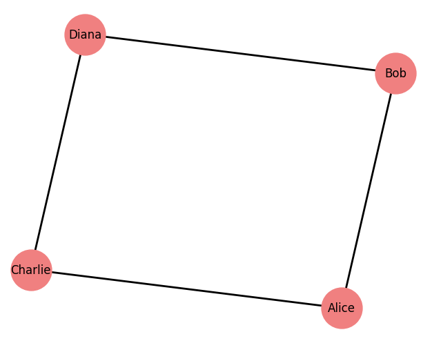
Here, the layout will produce a more spread-out and stable visualization. Adjusting k and iterations allows you to fine-tune the layout depending on graph size and density.
Interactive Force-Directed Graphs with Plotly in Python
Static graphs are useful for simple networks, but when working with larger datasets, interactive visualizations provide much better insights. With Plotly, you can create force-directed graphs in Python that are zoomable, pannable, and hover-enabled, making them perfect for dashboards and web applications.
Creating Interactive Graphs for Web and Dashboards
Plotly allows you to combine NetworkX layouts with its own interactive plotting capabilities. You first calculate the node positions using spring_layout() and then pass them into Plotly for rendering.
import networkx as nx
import plotly.graph_objects as go

# Create a graph
G = nx.Graph()
G.add_edges_from([
    ("Alice", "Bob"),
    ("Alice", "Charlie"),
    ("Bob", "Diana"),
    ("Charlie", "Diana"),
    ("Diana", "Eve"),
])

# Apply force-directed layout
pos = nx.spring_layout(G, seed=42)

# Extract edge coordinates
edge_x = []
edge_y = []
for edge in G.edges():
    x0, y0 = pos[edge[0]]
    x1, y1 = pos[edge[1]]
    edge_x.extend([x0, x1, None])
    edge_y.extend([y0, y1, None])

edge_trace = go.Scatter(
    x=edge_x, y=edge_y,
    line=dict(width=1, color='gray'),
    hoverinfo='none',
    mode='lines'
)

# Extract node coordinates
node_x = []
node_y = []
for node in G.nodes():
    x, y = pos[node]
    node_x.append(x)
    node_y.append(y)

node_trace = go.Scatter(
    x=node_x, y=node_y,
    mode='markers+text',
    text=list(G.nodes()),
    textposition="top center",
    hoverinfo='text',
    marker=dict(
        showscale=False,
        color='skyblue',
        size=20,
        line=dict(width=2, color='black')
    )
)

# Create figure
fig = go.Figure(data=[edge_trace, node_trace],
                layout=go.Layout(
                    title="Interactive Force-Directed Graph in Python",
                    title_x=0.5,
                    showlegend=False,
                    hovermode='closest',
                    margin=dict(b=0,l=0,r=0,t=40),
                    xaxis=dict(showgrid=False, zeroline=False),
                    yaxis=dict(showgrid=False, zeroline=False)
                ))

fig.show()
This produces a fully interactive graph: you can hover over nodes to see labels, drag the view, and zoom in and out.
Output:

Conclusion: Mastering Force-Directed Graphs in Python
Force-directed graph layouts are one of the most effective ways to visualize complex networks. By simulating physical forces, they arrange nodes and edges into a structure that reveals patterns, communities, and relationships naturally. In this tutorial, you learned how force-directed layouts work, how to set up your Python environment, and how to build both static graphs with NetworkX and Matplotlib as well as interactive visualizations with Plotly.
From social network analysis to knowledge graphs and biological research, force-directed graphs have countless real-world applications. With Python’s flexible libraries, you can go from a simple dataset to a powerful visualization that makes hidden connections easier to interpret.
By experimenting with layout parameters, node attributes, and interactivity, you can customize these graphs to fit your specific needs. Whether you are a data scientist, researcher, or developer, mastering force-directed graph visualization in Python will give you a valuable skill for turning raw data into meaningful insights.


