

Diagnostic Data Analytics with Python: Definitions, Techniques & Code Examples
- Jan 10, 2024
- 9 min read
Updated: Mar 11
Diagnostic Analytics: The Crucial Role of Diagnostic Analytics and involved techniques in Deciphering Complexities for Strategic Decision-Making and unearthing insights from historic datasets. In this blog we are going to dive into the basic definitions and python based sample examples for understanding this analytical technique.

What is Diagnostic Analytics?
Diagnostic analytics is a branch of analytics that focuses on examining data to understand why certain events or outcomes occurred within a specific context. It involves deep analysis of historical data to identify patterns, correlations, or anomalies that help explain past performance or occurrences. Diagnostic analytics is a facet of data analysis that delves into the depths of historical data to unravel the causes behind specific events or outcomes. It's akin to investigating the 'why' behind the 'what.' This branch of analytics doesn't just highlight trends or patterns; it goes further, aiming to unearth the reasons and factors driving those patterns. By scrutinizing correlations, anomalies, or relationships within datasets, diagnostic analytics aims to pinpoint the root causes of successes, failures, anomalies, or shifts in trends. It employs various methods such as statistical analysis, regression, and anomaly detection to dissect data, providing insights that help explain past performances or occurrences. This kind of analytics is invaluable across industries, aiding businesses in understanding the drivers of their success, unraveling the mysteries behind failures, and paving the way for informed decision-making based on robust historical evidence.
Diagnostic Data Analytics Techniques with Python Based Examples
Diagnostic analytics involves a range of techniques aimed at dissecting data to uncover the underlying causes behind specific outcomes or events. Diagnostic analytics, through these techniques, enables organizations to unravel complexities within their data, providing valuable insights into past occurrences and facilitating better decision-making for the future. Here are some key techniques used in diagnostic analytics:
1. Descriptive Statistics:
Descriptive statistics are the bedrock of data analysis, offering a succinct summary of the key features within a dataset. These statistical measures, ranging from central tendencies like mean, median, and mode to dispersion indicators such as variance and standard deviation, provide a comprehensive snapshot of the dataset's characteristics. They unveil the distribution's shape, whether it's symmetric or skewed, and help discern the presence of outliers or unusual patterns. Through percentiles and measures like quartiles and ranges, descriptive statistics offer insights into data spread and variability. Visual representations like histograms further aid in comprehending the frequency distribution. Altogether, descriptive statistics serve as a compass, guiding analysts and researchers in understanding, interpreting, and communicating the essence of the data to make informed decisions or draw meaningful conclusions.
Mean, Median, Mode: These measures provide central tendencies, giving an idea about the typical value within a dataset.
Variance and Standard Deviation: They depict the dispersion or spread of data points around the mean, showing how much individual data points differ from the average.
Python example demonstrating how to calculate Mean, Median, and Mode—the three fundamental measures of central tendency.
import statistics

data = [10, 15, 10, 20, 25, 30, 10, 20, 25]

print("Mean:", statistics.mean(data))
print("Median:", statistics.median(data))
print("Mode:", statistics.mode(data))  # raises exception if multimodal

Output:
Mean: 18.333333333333332
Median: 20
Mode: 10
Here’s a Python-based breakdown of three important Measures of Dispersion: Range, Variance, and Standard Deviation.
import statistics

# Sample data
data = [10, 15, 10, 20, 25, 30, 10, 20, 25]

# Range
range_value = max(data) - min(data)

# Mean
mean = sum(data) / len(data)

# Variance (manual)
squared_diffs = [(x - mean) ** 2 for x in data]
variance_manual = sum(squared_diffs) / len(data)  # population variance

# Variance using statistics module (sample variance)
variance_stats = statistics.variance(data)
population_variance = statistics.pvariance(data)

# Standard Deviation (manual)
std_dev_manual = variance_manual ** 0.5

# Standard Deviation using statistics module
std_dev_stats = statistics.stdev(data)  # sample std dev
population_std_dev = statistics.pstdev(data)

# Results
print("Range:", range_value)
print("Variance (Manual, Population):", variance_manual)
print("Variance (statistics, Sample):", variance_stats)
print("Standard Deviation (Manual, Population):", std_dev_manual)
print("Standard Deviation (statistics, Sample):", std_dev_stats)

Output:

Range: 20
Variance (Manual, Population): 49.99999999999999
Variance (statistics, Sample): 56.25
Standard Deviation (Manual, Population): 7.071067811865475
Standard Deviation (statistics, Sample): 7.5
2. Data Visualization:
Data visualization is the art of presenting complex information and datasets in a visually appealing and comprehensible format. It goes beyond mere charts and graphs; it's a language that transforms raw data into insightful narratives and patterns. Through various visual tools like graphs, charts, maps, and infographics, data visualization unveils trends, relationships, and outliers that might not be immediately evident in raw data. It enables quick comprehension, facilitating better decision-making and communication. By leveraging color, size, shapes, and interactive elements, data visualization engages audiences, making data more accessible and compelling. It bridges the gap between data analysis and understanding, empowering individuals across diverse fields—from business analytics to scientific research—to derive actionable insights and tell compelling stories from the wealth of available information.
Charts and Graphs: Visual representations such as bar graphs, line charts, histograms, or scatter plots help in understanding trends, patterns, and outliers within data.
Dashboards: Interactive and dynamic displays of key metrics and trends, offering a comprehensive view of multiple data points.
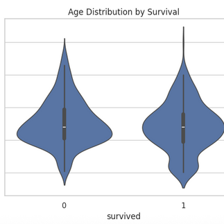
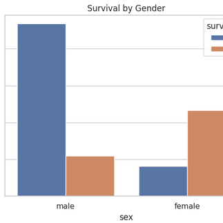
Few of the random example charts plotted using python over different datasets are shown below:


3. Correlation Analysis:
Correlation analysis is a powerful statistical method used to examine the relationship between two or more variables in a dataset. It measures the strength and direction of the linear association between these variables, indicating how changes in one variable might correspond to changes in another. The correlation coefficient, typically represented by the Pearson correlation coefficient, ranges from -1 to 1: a value close to 1 suggests a strong positive linear relationship, while a value close to -1 indicates a strong negative linear relationship. A value around 0 implies a weak or no linear relationship. Correlation analysis aids in understanding connections between variables, guiding decision-making processes and predictive models. However, it's crucial to note that correlation doesn’t imply causation—just because variables are correlated doesn't mean that one causes the other. It serves as a vital tool in many fields, including economics, social sciences, and data analytics, helping analysts and researchers to uncover meaningful associations within datasets.
Correlation matrix for variables of titanic dataset(a builtin pythonic dataset) is shown below:

4. Regression Analysis:
Regression analysis is a fundamental statistical technique used to explore the relationship between a dependent variable and one or more independent variables. Its primary goal is to understand how changes in the independent variables are associated with changes in the dependent variable. By fitting a regression model, often represented as a line or curve, to the data points, it allows for prediction, explanation, and inference. There are various types of regression models, such as linear regression, logistic regression, and polynomial regression, each suitable for different types of data and relationships. Regression analysis provides insights into the strength and direction of the relationships between variables, enabling predictions of future outcomes based on historical data. It's a pivotal tool in fields like machine learning, data analytics, economics, finance, healthcare, and social sciences, aiding in decision-making, hypothesis testing, and understanding the complex interplay among variables within a system. However, it's important to interpret regression results cautiously, considering factors like model assumptions, potential biases, and the limitations of the data.
A sample example of regression analysis done using neural networks over random dataset in the form of a scatter plot demonstrating actual vs predicted values is given below:

5. Anomaly Detection:
Anomaly detection is a crucial technique within data analysis focused on identifying patterns, events, or observations that deviate significantly from the expected or normal behavior within a dataset. Its primary objective is to pinpoint rare occurrences that stand out as anomalies, potentially indicating errors, fraud, or valuable insights. Various methods, including statistical approaches, machine learning algorithms, and pattern recognition techniques, are employed to detect these anomalies. Unsupervised learning methods like clustering or density estimation, as well as supervised methods using labeled data, are often utilized for this purpose. Anomaly detection finds applications across diverse fields such as cybersecurity, finance, healthcare, and manufacturing, aiding in fraud detection, fault diagnosis, quality control, and predictive maintenance. However, the challenge lies in differentiating true anomalies from normal variations and noise while adapting to evolving patterns in complex datasets, making anomaly detection an ongoing and adaptive process crucial for maintaining data integrity and making informed decisions.
A basic pythonic example for detecting Anomaly using z-score is given below:
import seaborn as sns
import numpy as np

# Load Titanic dataset
df = sns.load_dataset('titanic')

# Keep only 'fare' column and drop missing values
fare_data = df[['fare']].dropna()

# Calculate Z-scores
fare_data['z_score'] = (fare_data['fare'] - fare_data['fare'].mean()) / fare_data['fare'].std()

# Define threshold
threshold = 3

# Flag anomalies
fare_data['anomaly'] = fare_data['z_score'].abs() > threshold

# Print anomalies
anomalies = fare_data[fare_data['anomaly']]
print("Detected Fare Anomalies:")
print(anomalies)

Output:

Detected Fare Anomalies:
         fare   z_score  anomaly
27   263.0000  4.644393     True
88   263.0000  4.644393     True
118  247.5208  4.332899     True
258  512.3292  9.661740     True
299  247.5208  4.332899     True
311  262.3750  4.631815     True
341  263.0000  4.644393     True
377  211.5000  3.608038     True
380  227.5250  3.930516     True
438  263.0000  4.644393     True
527  221.7792  3.814891     True
557  227.5250  3.930516     True
679  512.3292  9.661740     True
689  211.3375  3.604768     True
700  227.5250  3.930516     True
716  227.5250  3.930516     True
730  211.3375  3.604768     True
737  512.3292  9.661740     True
742  262.3750  4.631815     True
779  211.3375  3.604768     True
6. Cohort Analysis:
Cohort analysis is a powerful method used in statistics and business analytics to understand and track the behavior and characteristics of specific groups, or cohorts, over time. By grouping individuals who share a common characteristic or experience within a defined timeframe, such as customers who signed up during a particular month or employees hired in a specific year, cohort analysis enables a detailed examination of their shared journey or patterns. It allows for the comparison of how different cohorts behave or perform, unveiling insights into trends, changes, or specific outcomes unique to each cohort. This analysis is pivotal in various fields, notably in marketing to assess customer lifetime value, retention rates, and product performance, as well as in healthcare to study patient outcomes based on treatment cohorts. Cohort analysis helps businesses and researchers make data-driven decisions by identifying trends and understanding the impact of certain actions or events on different groups over time.
Grouping Data: Segregating data into cohorts based on shared characteristics (e.g., age groups, customer segments) to analyze trends or behaviors within specific groups.
import pandas as pd
import seaborn as sns
import matplotlib.pyplot as plt

# Load Titanic dataset
df = sns.load_dataset('titanic')

# Drop rows with missing age or survived info
df = df[['age', 'survived']].dropna()

# Define age bins and labels
age_bins = [0, 12, 18, 35, 50, 65, 100]
age_labels = ['Child', 'Teenager', 'Young Adult', 'Adult', 'Middle Aged', 'Senior']

# Create age groups
df['age_group'] = pd.cut(df['age'], bins=age_bins, labels=age_labels)

# Group by age_group and calculate survival rate
grouped = df.groupby('age_group')['survived'].agg(['count', 'sum', 'mean']).reset_index()
grouped.columns = ['Age Group', 'Total Passengers', 'Survived', 'Survival Rate']

print(grouped)

Output:

     Age Group  Total Passengers  Survived  Survival Rate
0        Child                69        40       0.579710
1     Teenager                70        30       0.428571
2  Young Adult               358       137       0.382682
3        Adult               153        61       0.398693
4  Middle Aged                56        21       0.375000
5       Senior                 8         1       0.125000
7. Hypothesis Testing:
Hypothesis testing serves as the backbone of statistical inference, offering a systematic approach to validate or refute claims about population parameters using sample data. It revolves around assessing the strength of evidence against the null hypothesis, which typically represents the status quo or absence of an effect. The process involves setting up a null hypothesis (H0) and an alternative hypothesis (H1), selecting a significance level to determine the threshold for accepting or rejecting the null hypothesis, choosing an appropriate statistical test, collecting data, and drawing conclusions based on the test results. The significance level, often denoted as α, determines the probability of making a Type I error—rejecting a true null hypothesis. Statistical tests generate a test statistic, compared to a critical value to decide whether to reject the null hypothesis. If the test statistic falls into the critical region, beyond the critical value, the null hypothesis is rejected in favor of the alternative. Hypothesis testing finds extensive application in research, quality control, medical trials, and business analytics, providing a structured approach to make evidence-based decisions and draw meaningful conclusions about the characteristics of populations or the effectiveness of interventions. Its robust framework ensures that conclusions drawn from sample data are grounded in statistical evidence, offering a reliable means to assess claims and drive informed decision-making.
T-Tests, Chi-Square Tests: Statistical techniques used to test hypotheses about the relationships or differences between variables within a dataset.
A python programming based example for this is given below:
import seaborn as sns
import pandas as pd
from scipy.stats import ttest_ind

# Load Titanic dataset
df = sns.load_dataset('titanic')

# Drop missing values
df = df[['fare', 'sex']].dropna()

# Separate fares by gender
male_fares = df[df['sex'] == 'male']['fare']
female_fares = df[df['sex'] == 'female']['fare']

# Independent t-test
t_stat, p_val = ttest_ind(male_fares, female_fares, equal_var=False)

print(f"T-statistic: {t_stat:.4f}")
print(f"P-value: {p_val:.4f}")

Output:

T-statistic: -5.0775
P-value: 0.0000
8. Root Cause Analysis:
Root cause analysis (RCA) is a systematic method used to identify the underlying reason(s) responsible for a problem or an occurrence, aiming to address the core issue rather than its symptoms. It involves a structured approach that investigates events, incidents, or issues to understand the chain of causes leading to the observed outcome. The primary goal is to prevent the problem from recurring by addressing its fundamental causes. RCA is employed across various industries, including healthcare, manufacturing, aviation, and engineering, as a proactive approach to problem-solving and continuous improvement. By focusing on addressing the fundamental reasons behind issues, RCA aims to prevent future occurrences, enhance processes, and promote a culture of learning and improvement within organizations.
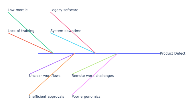
Fishbone Diagrams, 5 Whys: Qualitative techniques aimed at systematically identifying the underlying causes of issues or problems within a system.
A sample Fishbone diagram generated over random data is given below:
Conclusion: Turning Data into Actionable Insights
Diagnostic data analytics goes beyond simply describing what has happened—it dives deeper to understand why it happened. By leveraging techniques such as hypothesis testing, root cause analysis, anomaly detection, and time series analysis, data professionals can pinpoint the factors driving outcomes and system behaviors.
In this post, we demonstrated what diagnostic data analytics is and how Python can be used to implement key diagnostic tools like T-tests, Chi-square tests, 5 Whys logic, Fishbone diagrams, and Z-score-based anomaly detection, using real-world datasets. These methods are essential for analysts aiming to uncover insights that inform strategic decision-making, problem-solving, and continuous process improvement.
Mastering diagnostic analytics equips organizations to not only respond to issues, but to proactively improve performance, reduce inefficiencies, and design more effective systems. Combined with Python's data handling and visualization capabilities, these techniques become even more powerful—making data science both insightful and actionable.


