

Descriptive Analytics in Python: Statistics, Visualization, and Data Exploration
- Jan 7, 2024
- 13 min read
Updated: Mar 10
Python has emerged as a leading tool for descriptive analytics thanks to its rich ecosystem of data science libraries. With NumPy and Pandas, analysts can efficiently process and summarize datasets, while Matplotlib and Seaborn make it easy to create compelling visualizations that reveal patterns and trends at a glance.
In this guide, we dive into the essential techniques of descriptive analytics using Python. You’ll learn how to compute statistical measures such as mean, median, variance, and percentiles, explore data distributions through histograms, line charts, scatter plots, and box plots, and uncover hidden patterns using clustering and segmentation methods like K-Means and hierarchical clustering. Additionally, we cover advanced exploratory methods—including correlation matrices, pivot tables, and word frequency analysis—to help you interpret data more effectively.
By following these hands-on examples, you will gain the skills to analyze datasets comprehensively, uncover insights, and prepare data for more advanced stages of analytics, including predictive and prescriptive modeling.

What is Descriptive Analytics?
Descriptive analytics is the process of analyzing historical data to identify patterns, trends, and key insights that explain past performance. It focuses on transforming raw datasets into meaningful summaries through statistical calculations, aggregation, and data visualization. Instead of predicting future outcomes or recommending actions, descriptive analytics concentrates on answering a straightforward question: what happened in the data?
Organizations rely on descriptive analytics to interpret large volumes of information generated from transactions, customer interactions, operational systems, and digital platforms. By calculating metrics such as averages, totals, percentages, and distributions, analysts can quickly understand business performance, user behavior, or operational efficiency. Visual tools like charts, graphs, and dashboards further enhance this understanding by presenting complex data in an accessible format.
In modern data science workflows, descriptive analytics serves as the foundation of the analytics pipeline. Before building predictive models or optimization systems, analysts must first explore and understand the dataset itself. Techniques such as summary statistics, data aggregation, and visualization help uncover trends, anomalies, and relationships that guide further analysis
In short, descriptive analytics converts raw data into clear summaries that help organizations understand their past performance and establish the groundwork for more advanced analytics techniques like predictive and prescriptive modeling.
Key Aspects of Descriptive Analytics:
Descriptive analytics focuses on converting raw datasets into structured insights that help organizations understand past performance. By applying statistical analysis and visualization techniques, analysts can identify trends, patterns, and anomalies hidden within large volumes of data. Several core processes make descriptive analytics effective in transforming unstructured information into meaningful summaries.
1. Data Collection and Cleaning
The first step in descriptive analytics involves gathering data from various sources such as databases, transactions, sensors, or digital platforms. Once collected, the data must be cleaned to ensure reliability and consistency. This process includes handling missing values, correcting formatting issues, and identifying outliers that may distort analysis. Clean data forms the foundation for accurate insights.
2. Data Summarization and Aggregation
After preparing the dataset, analysts summarize the information using statistical measures such as mean, median, mode, and standard deviation. These metrics help describe the distribution and central tendencies within the data. Aggregation techniques further group information into categories, enabling analysts to examine patterns across segments like time periods, product categories, or customer groups.
3. Visualization Techniques
Visual representation plays a crucial role in descriptive analytics because humans understand patterns faster through images than raw numbers. Charts, bar graphs, histograms, and heatmaps make it easier to interpret large datasets and identify trends or unusual behavior. Effective visualizations help decision-makers quickly grasp key insights without analyzing complex tables of numbers.
4. Exploratory Data Analysis (EDA)
Exploratory Data Analysis allows analysts to investigate relationships between variables before applying more advanced models. Techniques such as scatter plots, box plots, and correlation matrices reveal hidden connections, anomalies, and structural patterns within the dataset. EDA often serves as a bridge between basic descriptive analytics and more advanced stages such as predictive modeling.
Together, these aspects form the backbone of descriptive analytics. By collecting reliable data, summarizing it with statistical techniques, visualizing patterns, and exploring relationships within the dataset, analysts can develop a clear understanding of historical trends and performance. This foundational understanding is essential before moving toward more advanced analytics techniques that forecast outcomes or recommend optimal decisions.
Techniques and Methods in Descriptive Analytics with examples in Python
Descriptive analytics relies on several statistical techniques that help summarize and interpret historical data. These methods allow analysts to identify patterns, understand distributions, and extract meaningful insights from datasets. One of the most fundamental groups of techniques used in descriptive analytics is measures of central tendency, which help identify the typical or representative value within a dataset.
1. Measures of Central Tendency
Measures of central tendency provide a single value that represents the center of a dataset. These metrics help analysts quickly understand the general behavior of the data and compare distributions across different datasets.
The three primary measures of central tendency include:
Mean – The mean represents the average value of a dataset. It is calculated by summing all values and dividing the result by the total number of observations.
Median – The median represents the middle value of an ordered dataset. After sorting the data from smallest to largest, the median is the value located at the center of the distribution.
Mode – The mode refers to the value that appears most frequently in a dataset. Some datasets may contain more than one mode if multiple values occur with the same highest frequency.
Together, these measures provide a quick statistical summary of a dataset and help analysts understand its central behavior.
Python provides built-in tools for computing these statistics efficiently. The statistics module includes functions that calculate common descriptive metrics with minimal code.
import statistics

data = [10, 15, 10, 20, 25, 30, 10, 20, 25]
print("Mean:", statistics.mean(data))
print("Median:", statistics.median(data))
print("Mode:", statistics.mode(data))
In this example, the mean provides the average value of the dataset, the median identifies the middle value after sorting the numbers, and the mode reveals the most frequently occurring value. These measures are often the first step in descriptive analysis because they quickly summarize the general characteristics of a dataset before deeper exploration and visualization techniques are applied.
2. Measures of Dispersion:
While measures of central tendency describe the typical value of a dataset, measures of dispersion explain how widely the data is spread around that central value. Understanding dispersion helps analysts determine if data points are tightly clustered or widely distributed across a range of values.
In descriptive analytics, dispersion metrics are essential for identifying variability, detecting outliers, and understanding the reliability of averages.
The most common measures of dispersion include:
Standard Deviation – Standard deviation measures how much the values in a dataset deviate from the mean. A smaller standard deviation indicates that the data points are closer to the average, while a larger value suggests greater variability.
Variance – Variance measures the average of the squared differences between each data point and the mean. It provides a numerical representation of how far the values spread from the center of the dataset.
Range – The range is the simplest measure of dispersion and represents the difference between the highest and lowest values in a dataset.
Together, these metrics help analysts understand the stability and variability of data before performing deeper analysis or building predictive models.
Python provides multiple ways to calculate dispersion metrics. The statistics module makes it straightforward to compute variance and standard deviation, while simple Python operations can calculate the range.
import statistics

# Sample data
data = [10, 15, 10, 20, 25, 30, 10, 20, 25]

range_value = max(data) - min(data)
mean = sum(data) / len(data)
squared_diffs = [(x - mean) ** 2 for x in data]
variance_manual = sum(squared_diffs) / len(data)

# Variance using statistics module (sample variance)
variance_stats = statistics.variance(data)
population_variance = statistics.pvariance(data)

# Standard Deviation (manual)
std_dev_manual = variance_manual ** 0.5

# Standard Deviation using statistics module
std_dev_stats = statistics.stdev(data)  # sample std dev
population_std_dev = statistics.pstdev(data)

# Results
print("Range:", range_value)
print("Variance (Manual, Population):", variance_manual)
print("Variance (statistics, Sample):", variance_stats)
print("Standard Deviation (Manual, Population):", std_dev_manual)
print("Standard Deviation (statistics, Sample):", std_dev_stats)

Output:

Range: 20
Variance (Manual, Population): 49.99999999999999
Variance (statistics, Sample): 56.25
Standard Deviation (Manual, Population): 7.071067811865475
Standard Deviation (statistics, Sample): 7.5
In this example, the range shows the overall spread of the dataset, while variance and standard deviation provide more detailed measures of variability around the mean. These metrics help analysts understand how stable or dispersed the data values are, making them an essential part of descriptive analytics and exploratory data analysis.
3. Graphical Representation & Visualizations
While statistical measures summarize datasets numerically, visualizations help reveal patterns that numbers alone might hide. Graphical representation allows analysts to quickly identify trends, clusters, distributions, and potential outliers within a dataset. In descriptive analytics, visual tools make complex data easier to interpret and communicate to stakeholders.
Common visualization techniques include bar charts, line graphs, scatter plots, and histograms. Among these, histograms are particularly useful for understanding the distribution of numerical data.
A) Histograms
A histogram is a graphical representation that displays the frequency distribution of numerical values. The dataset is divided into intervals called bins, and each bin is represented by a bar. The height of the bar indicates how many data points fall within that specific range.
Histograms help analysts understand how data is distributed, showing patterns such as concentration, skewness, and spread.
Python makes it easy to generate visualizations using libraries like Matplotlib. The following example demonstrates how to create a simple histogram from a dataset.
import matplotlib.pyplot as plt

# Sample data
data = [10, 15, 10, 20, 25, 30, 10, 20, 25, 30, 35, 40, 25, 30, 20]

# Create histogram
plt.hist(data, bins=6, color='skyblue', edgecolor='black')

# Add titles and labels
plt.title("Histogram of Sample Data")
plt.xlabel("Value Range")
plt.ylabel("Frequency")

# Show plot
plt.show()
B) Bar Charts
A bar chart or bar graph is a chart or graph that presents categorical data with rectangular bars with heights or lengths proportional to the values that they represent. The bars can be plotted vertically or horizontally. A vertical bar chart is sometimes called a column chart.
Python implementation of Bar Charts.
import matplotlib.pyplot as plt

# Sample categorical data
categories = ['Python', 'Java', 'C++', 'JavaScript', 'Go']
values = [60, 45, 30, 50, 20]

# Create bar chart
plt.bar(categories, values, color='mediumseagreen', edgecolor='black')

# Add labels and title
plt.title("Programming Language Popularity")
plt.xlabel("Languages")
plt.ylabel("Number of Users (in millions)")

# Display the chart
plt.show()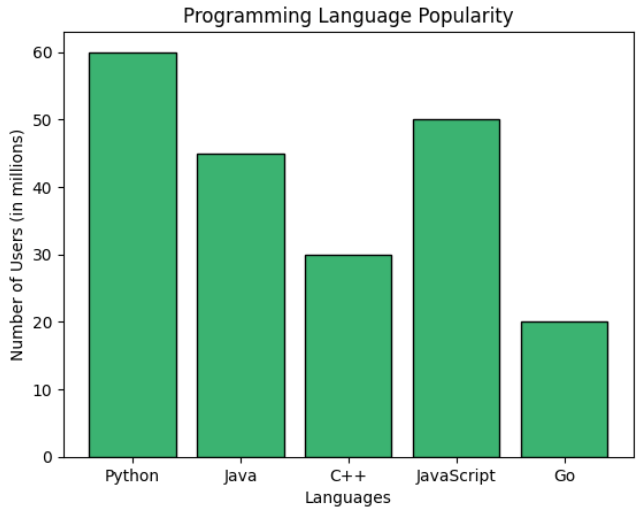
C) Line Charts
Line charts are one of the most commonly used visualization techniques in descriptive analytics, especially when analyzing data that changes over time. They display information as a series of data points connected by straight lines, making it easy to observe trends, patterns, and fluctuations across a sequence of values.
Line charts are widely used in areas such as financial analysis, sales tracking, website traffic monitoring, and performance measurement. By plotting data along a continuous axis, usually representing time, analysts can quickly identify upward trends, downward movements, seasonal patterns, or sudden changes in behavior.
Python libraries such as Matplotlib make it straightforward to create line charts for visualizing trends within datasets.
import matplotlib.pyplot as plt

# Sample time series data
months = ['Jan', 'Feb', 'Mar', 'Apr', 'May', 'Jun']
sales = [250, 300, 280, 350, 400, 420]

plt.plot(months, sales, marker='o', color='teal', linestyle='-')
plt.title("Monthly Sales Trend")
plt.xlabel("Month")
plt.ylabel("Sales ($)")
plt.grid(True)
plt.tight_layout()
plt.show()
D) Pie Charts
A pie chart is a circular visualization used to represent proportions within a dataset. The entire circle represents the whole, while each slice corresponds to a specific category’s contribution to that total. The size of each slice reflects the relative percentage of the dataset it represents.
Pie charts are particularly useful when analysts want to show how different categories contribute to a total value. They are commonly used for visualizing market share, budget allocation, survey results, and categorical distributions where the sum of all categories equals 100 percent.
Python libraries such as Matplotlib allow analysts to easily create pie charts for categorical data visualization.
labels = ['Python', 'JavaScript', 'Java', 'C++', 'Go']
sizes = [30, 25, 20, 15, 10]
colors = ['gold', 'lightcoral', 'lightskyblue', 'lightgreen', 'violet']

plt.pie(sizes, labels=labels, colors=colors, autopct='%1.1f%%', startangle=140)
plt.axis('equal')  # Keeps the pie chart circular
plt.title("Programming Language Market Share")
plt.tight_layout()
plt.show()
In this example, the pie chart illustrates the relative share of different programming languages. Each slice represents the percentage contribution of a language within the dataset, making it easy to compare how each category contributes to the overall distribution.
E) Scatter Plots
A scatter plot is a visualization technique used to examine the relationship between two numerical variables. Each data point is represented as a dot positioned according to its values on the horizontal and vertical axes. By observing how the dots are distributed across the chart, analysts can quickly detect correlations, clusters, and potential outliers.
Scatter plots are particularly useful in exploratory data analysis because they help identify relationships that might not be obvious through summary statistics alone. They are widely used in fields such as economics, machine learning, marketing analytics, and scientific research to explore how one variable influences another.
Using libraries such as NumPy and Matplotlib, creating scatter plots in Python becomes straightforward.
import numpy as np

x = np.random.randint(10, 50, 30)
y = x + np.random.randint(-10, 10, 30)

plt.scatter(x, y, color='purple')
plt.title("Scatter Plot: X vs Y")
plt.xlabel("X-axis values")
plt.ylabel("Y-axis values")
plt.grid(True)
plt.tight_layout()
plt.show()
Here, each point represents a pair of values from the dataset. Visualizing data this way makes it easier to observe trends or relationships between variables.

F) Bubble Charts
A bubble chart is an extension of a scatter plot that adds a third dimension to the visualization. In addition to the x and y coordinates, the size of each bubble represents another variable, allowing analysts to visualize three different variables simultaneously.
Bubble charts are commonly used in business analytics to compare factors such as cost, value, and risk, or to evaluate relationships between revenue, market share, and growth rates.
Python can generate bubble charts using the scatter function by adjusting the size parameter for each data point.
x = np.random.rand(20) * 100
y = np.random.rand(20) * 100
sizes = np.random.rand(20) * 1000  # Bubble size

plt.scatter(x, y, s=sizes, alpha=0.5, color='tomato')
plt.title("Bubble Chart: Cost vs Value with Risk Bubble Size")
plt.xlabel("Cost")
plt.ylabel("Value")
plt.grid(True)
plt.tight_layout()
plt.show()
Here, the size of each bubble represents an additional variable, allowing analysts to compare three dimensions of data within a single visualization.

G) Box Plots
A box plot is a statistical visualization used to display the distribution of a dataset using the five-number summary: minimum, first quartile (Q1), median, third quartile (Q3), and maximum. It provides a compact way to understand the spread of data, detect skewness, and identify potential outliers.
Box plots are widely used in descriptive analytics and exploratory data analysis because they reveal patterns in data distribution that may not be visible in simple averages or summary statistics.
Libraries such as Seaborn make it easy to create box plots for statistical visualization.
import seaborn as sns

# Sample numerical data
data = [55, 60, 62, 70, 75, 78, 79, 80, 82, 85, 90, 95, 100, 110, 115, 120]

sns.boxplot(data=data, color='skyblue')
plt.title("Box Plot of Values")
plt.xlabel("Distribution")
plt.tight_layout()
plt.show()
This visualization highlights the median value, the interquartile range, and any outliers within the dataset. As a result, analysts can quickly evaluate how data points are distributed and identify unusual values that may require further investigation.

A Box and Whisker Plot (or Box Plot) is a convenient way of visually displaying groups of numerical data through their quartiles.
The "whisker" in a Box-and-Whisker Plot (commonly just called a Box Plot) refers to the lines extending from the box — they represent the variability outside the upper and lower quartiles and help visualize spread, skewness, and outliersin a dataset.
4. Other Important Techniques Used in Descriptive Analytics
Beyond visualizations and clustering methods, descriptive analytics also relies on several statistical and analytical techniques that help interpret datasets more effectively. These methods assist analysts in identifying relationships between variables, understanding data distributions, and summarizing large volumes of information into meaningful insights. When used together, they form the foundation of exploratory data analysis and provide the groundwork for deeper predictive or prescriptive modeling.
A) Clustering and Segmentation Techniques
Clustering and segmentation techniques are commonly used in descriptive analytics to discover natural groupings within data. These approaches belong to unsupervised learning, meaning the algorithm identifies patterns without predefined labels.
By grouping similar observations together, clustering helps analysts uncover hidden structures in datasets. Businesses frequently use these techniques for customer segmentation, market analysis, fraud detection, and recommendation systems.
1. K-Means Clustering
K-Means clustering is one of the most widely used clustering algorithms in data analytics. The method divides a dataset into a predefined number of clusters (K) by assigning each data point to the nearest cluster center.
The algorithm works iteratively by:
Selecting initial cluster centroids
Assigning data points to the nearest centroid
Recalculating centroid positions based on assigned points
Repeating the process until the clusters stabilize
The objective of K-Means is to minimize the distance between data points and their respective cluster centers, ensuring that points within the same cluster are as similar as possible.
In Python, K-Means clustering is commonly implemented using libraries such as scikit-learn, and the resulting clusters are often visualized using scatter plots.
2. Hierarchical Clustering
Hierarchical clustering is another widely used clustering technique that builds a hierarchy of clusters instead of creating a fixed number of groups at the beginning.
This method works by gradually merging or splitting clusters based on similarity measures. The results are typically visualized using a dendrogram, which represents the hierarchical relationship between clusters.
Hierarchical clustering is particularly useful when analysts want to explore the underlying structure of data and determine the optimal number of clusters visually.
B) Exploratory Data Analysis (EDA)
Exploratory Data Analysis (EDA) is a crucial first step in any data analysis workflow. It focuses on examining datasets using statistical summaries and visualizations to uncover patterns, anomalies, and relationships that might otherwise go unnoticed. By applying EDA techniques, analysts gain a deeper understanding of their data, which informs subsequent modeling or predictive analytics.
EDA combines both graphical and numerical methods to provide insights quickly. Key techniques include:
1. Correlation Matrix
A correlation matrix measures the relationship between multiple variables in a dataset. Each cell in the matrix contains a correlation coefficient that ranges from -1 to 1, indicating the strength and direction of the relationship between two variables.
1 indicates a strong positive relationship
0 indicates no relationship
-1 indicates a strong negative relationship
Correlation matrices are widely used during exploratory data analysis to identify dependencies between features and detect potential multicollinearity in datasets.
2. Frequency Tables
A frequency table summarizes how often each value appears in a dataset. It provides a simple yet powerful way to understand the distribution of categorical or discrete variables.
By counting the number of occurrences of each category, analysts can quickly identify dominant patterns, popular choices, or unusual distributions within the data.
3. Percentiles and Quartiles
Percentiles divide a dataset into 100 equal parts, helping analysts understand how individual data points compare to the overall distribution. Quartiles are a special type of percentile that divide data into four equal sections.
Important quartiles include:
Q1 (25th percentile) – lower quartile
Q2 (50th percentile) – median
Q3 (75th percentile) – upper quartile
These metrics help measure the spread of data and are commonly used when analyzing distributions and detecting outliers.
4. Cross-Tabulations
Cross-tabulation, often referred to as a contingency table, is used to analyze the relationship between two or more categorical variables. It displays the frequency of different combinations of categories in a structured table.
This technique is widely used in survey analysis, market research, and demographic studies to understand how different variables interact with each other.
5. Pivot Tables
Pivot tables provide a powerful way to summarize large datasets by reorganizing information across multiple dimensions. They allow analysts to group, filter, and aggregate data quickly to reveal meaningful patterns.
Pivot tables are commonly used in tools such as Excel, Pandas, and various business intelligence platforms to perform fast data summarization.
6. Word Frequency Analysis
Word frequency analysis measures how often specific words or phrases appear within a text dataset. This method is widely used in text analytics and natural language processing to identify dominant topics, recurring themes, and patterns in textual data.
It is often used in sentiment analysis, customer feedback evaluation, and social media analytics.
Through these techniques, EDA transforms raw data into actionable insights, providing a strong foundation for deeper statistical modeling or machine learning applications.
Conclusion
Descriptive analytics lays the foundation for deeper data understanding by transforming raw numbers into meaningful insights. Through techniques like measures of central tendency, dispersion, and visualizations such as bar charts, line graphs, and box plots, you gain clarity about patterns within your data. Combined with clustering and segmentation, these methods enable better categorization and interpretation. With Python as your tool, you're now equipped to explore, summarize, and communicate data effectively—setting the stage for more advanced analytics and decision-making.
These techniques as discussed above in descriptive analytics enable data analysts and decision-makers to explore, summarise, and interpret historical data effectively, facilitating insights and informed decision-making. Each technique serves a unique purpose in understanding and describing various aspects of the data.


