

Exploratory Data Analysis (EDA) with Python: Discovering Insights Before You Predict
- Jan 7, 2024
- 9 min read
Updated: Mar 11
In data science, understanding your dataset is the foundation for any meaningful analysis. Exploratory Data Analysis (EDA) allows you to uncover patterns, detect anomalies, and identify relationships between features before diving into modeling. In this guide, we’ll walk you through Exploratory Data Analysis (EDA) using Python in as step-by-step, combining statistical summaries, visualizations, and practical coding examples.
Using the Titanic dataset, you’ll learn how to inspect data structures, handle missing values, visualize distributions, and explore feature relationships. By the end of this walkthrough, you’ll gain a solid grasp of your data — transforming raw information into actionable insights and setting the stage for predictive and prescriptive analytics.

Exploratory Data Analysis (EDA): Uncovering the Story Hidden in Your Data
Before diving into machine learning models or predictive analytics, it's essential to take a moment and truly understandthe data you're working with. That’s where Exploratory Data Analysis (EDA) comes in — the process of making sense of data before making assumptions about it. Think of EDA as the detective phase of data science, where you're trying to understand what's going on, what's normal, what's unusual, and what questions you might ask next.
EDA is more than just crunching numbers. It's about looking at the data visually, summarizing it statistically, and spotting patterns or oddities that might otherwise go unnoticed. It’s the stage where you explore — not predict — and where you ask "what is this data trying to tell me?"
Using a combination of statistical summaries, graphical techniques, and relationship analyses, EDA gives you a holistic view of the dataset. It helps in uncovering trends, correlations, anomalies, and missing values — all the things that influence how the rest of your data pipeline will perform.
Most importantly, it equips you to make informed decisions about how to clean, transform, and model your data going forward.
What Are the Goals of Exploratory Data Analysis (EDA)?
Exploratory Data Analysis (EDA) is a crucial first step in any data science workflow. Its purpose is not to follow a rigid checklist, but to provide a clear understanding of the dataset and uncover insights that guide subsequent analysis and modeling. By systematically exploring the data, analysts can detect patterns, anomalies, and relationships that might otherwise remain hidden. Key objectives of EDA include:
Understanding the Data Structure: Explore the size of the dataset, the types of variables, data distributions, and identify missing values or duplicated records.
Detecting Patterns and Relationships: Examine trends over time or correlations between variables to understand how features interact.
Spotting Anomalies and Outliers: Identify unusual data points that could skew results and decide how to handle them appropriately.
Formulating Hypotheses: Generate initial questions and hypotheses that can be tested and refined during the modeling phase.
By focusing on these goals, EDA transforms raw data into meaningful insights, providing a solid foundation for more advanced statistical analysis, predictive modeling, or machine learning applications.
Core Techniques Used in Exploratory Data Analysis (EDA)
To accomplish the objectives of EDA, data scientists leverage a variety of techniques that help them summarize, visualize, and understand the dataset from multiple perspectives. These methods allow analysts to uncover patterns, identify anomalies, detect relationships between variables, and prepare the data for further modeling. By combining statistical analysis, visualization, and clustering methods, EDA provides a solid foundation for making data-driven decisions.
Descriptive Statistics - Get a quick snapshot of your dataset using metrics like mean, median, mode, range, and standard deviation.
Univariate Analysis - Focus on individual variables to understand their distribution. Tools like histograms, box plots, and bar chartscome in handy here.
Bivariate and Multivariate Analysis - Examine how variables relate to one another through scatter plots, correlation matrices, and heatmaps. These reveal hidden patterns or relationships in the data.
Data Visualization - Charts like line graphs, violin plots, and pie charts help make data easier to interpret visually and communicate to non-technical stakeholders.
Outlier Detection - Spot outliers using methods like Z-score analysis or box plots. These data points might need to be excluded or separately analyzed, depending on the context.
Handling Missing Data - Use techniques like mean/median imputation, forward fill, or more advanced strategies to address incomplete data entries.
Dimensionality Reduction - Tools like Principal Component Analysis (PCA) and t-SNE help reduce the complexity of your dataset, making it easier to visualize and analyze high-dimensional data.
Clustering and Segmentation - Use unsupervised learning techniques like K-means clustering to group similar data points. This helps identify subgroups and behavioral patterns within the dataset.
Frameworks and Libraries for Exploratory Data Analysis (EDA) in Python
Python provides a rich ecosystem of libraries that make performing EDA both efficient and insightful. These tools allow analysts to manipulate data, calculate statistics, visualize trends, and even generate automated reports, all with minimal code. Some of the most commonly used libraries include:
Pandas – For data manipulation, cleaning, and summarization, making it easy to handle large datasets.
Matplotlib & Seaborn – For creating both basic and advanced visualizations that are informative and aesthetically pleasing.
Plotly – For interactive, browser-based plots that allow users to explore data dynamically.
NumPy & SciPy – For numerical operations, linear algebra, and statistical calculations.
Scikit-learn – For implementing advanced techniques such as clustering, dimensionality reduction, and preprocessing.
Sweetviz / Pandas-Profiling – For automated EDA reports that quickly summarize distributions, correlations, missing values, and data quality issues.
By leveraging these frameworks, analysts can efficiently explore datasets, uncover patterns, and prepare data for more advanced modeling or predictive analytics tasks.
Skipping or rushing through EDA is like trying to write a book without understanding your characters.
It’s during this exploratory phase that you gain the most intuition about the data — how clean or messy it is, what surprises it holds, and where you should focus your energy going forward. Whether you're building a model, creating dashboards, or simply trying to understand a dataset for business decisions, EDA lays the groundwork for everything that follows.
Now that we've walked through the concepts and techniques of EDA, it's time to get our hands dirty. In the next section, we’ll demonstrate these principles in action using Python and some real-world data.
Exploratory Data Analysis (EDA) on Titanic Dataset using Python
To illustrate how Exploratory Data Analysis (EDA) with Python works in practice, we will perform a step-by-step analysis of the famous Titanic dataset. This dataset contains information about passengers, including attributes such as age, passenger class, gender, and survival status. By applying Python libraries like pandas, numpy, matplotlib, and seaborn, we can uncover patterns, detect anomalies, and gain actionable insights into factors affecting survival rates.
1. Import Libraries and Load Data
We start by importing the required Python libraries. pandas and numpy help with data handling and numerical operations. seaborn and matplotlib.pyplot are used for creating plots and charts. We set Seaborn's style to "whitegrid" for cleaner visuals.
The Titanic dataset is loaded using Seaborn’s built-in load_dataset() function. It includes information about passengers such as age, class, gender, and survival status. Using df.head(), we preview the first few rows to get an initial look at the data.
import pandas as pd
import numpy as np
import seaborn as sns
import matplotlib.pyplot as plt

# Set plot style
sns.set(style="whitegrid")

# Load Titanic dataset from Seaborn
df = sns.load_dataset('titanic')

# Display first 5 rows
df.head()
This setup gives us a solid starting point for deeper analysis, allowing us to explore distributions, relationships between features, and patterns related to survival outcomes. Below is a peek into the dataset:
index | survived | pclass | sex | age | sibsp | parch | fare | embarked | class | who | adult_male | deck | embark_town | alive | alone |
0 | 0 | 3 | male | 22.0 | 1 | 0 | 7.25 | S | Third | man | true | NaN | Southampton | no | false |
1 | 1 | 1 | female | 38.0 | 1 | 0 | 71.2833 | C | First | woman | false | C | Cherbourg | yes | false |
2 | 1 | 3 | female | 26.0 | 0 | 0 | 7.925 | S | Third | woman | false | NaN | Southampton | yes | true |
3 | 1 | 1 | female | 35.0 | 1 | 0 | 53.1 | S | First | woman | false | C | Southampton | yes | false |
4 | 0 | 3 | male | 35.0 | 0 | 0 | 8.05 | S | Third | man | true | NaN | Southampton | no | true |
2. Dataset Overview
Before diving into analysis, we quickly inspect the structure of the dataset. The shape tells us the number of rows and columns. df.info() shows data types and non-null counts for each column, helping us spot missing values. Finally, df.describe() provides summary statistics for both numeric and categorical features.
# Shape of the dataset
print("Shape of dataset:", df.shape)

# Data types and non-null counts
print("\nInfo:")
df.info()

# Summary statistics
print("\nSummary Statistics:")
df.describe(include='all')
The summary statistics table provides a quick quantitative snapshot of the Titanic dataset. For numerical features like age and fare, it shows measures such as the mean, standard deviation, minimum, maximum, and quartiles, giving insight into the distribution and spread of values. For categorical features such as sex, embarked, or class, the table displays counts, unique values, and the most frequent category, helping identify dominant groups and potential imbalances.
This overview is essential for understanding the dataset at a glance and serves as a foundation for deeper analysis, such as detecting anomalies, comparing distributions, and planning data preprocessing steps.
index | survived | pclass | sex | age | sibsp | parch | fare | embarked | class | who | adult_male | deck | embark_town | alive | alone |
count | 891.0 | 891.0 | 891 | 714.0 | 891.0 | 891.0 | 891.0 | 889 | 891 | 891 | 891 | 203 | 889 | 891 | 891 |
unique | NaN | NaN | 2 | NaN | NaN | NaN | NaN | 3 | 3 | 3 | 2 | 7 | 3 | 2 | 2 |
top | NaN | NaN | male | NaN | NaN | NaN | NaN | S | Third | man | true | C | Southampton | no | true |
freq | NaN | NaN | 577 | NaN | NaN | NaN | NaN | 644 | 491 | 537 | 537 | 59 | 644 | 549 | 537 |
mean | 0.3838383838383838 | 2.308641975308642 | NaN | 29.69911764705882 | 0.5230078563411896 | 0.38159371492704824 | 32.204207968574636 | NaN | NaN | NaN | NaN | NaN | NaN | NaN | NaN |
std | 0.4865924542648585 | 0.8360712409770513 | NaN | 14.526497332334044 | 1.1027434322934275 | 0.8060572211299559 | 49.693428597180905 | NaN | NaN | NaN | NaN | NaN | NaN | NaN | NaN |
min | 0.0 | 1.0 | NaN | 0.42 | 0.0 | 0.0 | 0.0 | NaN | NaN | NaN | NaN | NaN | NaN | NaN | NaN |
25% | 0.0 | 2.0 | NaN | 20.125 | 0.0 | 0.0 | 7.9104 | NaN | NaN | NaN | NaN | NaN | NaN | NaN | NaN |
50% | 0.0 | 3.0 | NaN | 28.0 | 0.0 | 0.0 | 14.4542 | NaN | NaN | NaN | NaN | NaN | NaN | NaN | NaN |
75% | 1.0 | 3.0 | NaN | 38.0 | 1.0 | 0.0 | 31.0 | NaN | NaN | NaN | NaN | NaN | NaN | NaN | NaN |
max | 1.0 | 3.0 | NaN | 80.0 | 8.0 | 6.0 | 512.3292 | NaN | NaN | NaN | NaN | NaN | NaN | NaN | NaN |
3. Checking Missing Values
Missing data can affect the quality of our analysis, so it's important to identify it early. Using isnull().sum(), we count missing values in each column and sort them in descending order. We then display only the columns that have missing entries.
# Count of missing values
missing = df.isnull().sum().sort_values(ascending=False)
missing[missing > 0]
deck | 688 |
age | 177 |
embarked | 2 |
embark_town | 2 |
4. Univariate Analysis
This analysis provides a focused look at individual variables, helping us understand their distribution, frequency, and potential anomalies. For categorical features in the Titanic dataset—such as survival status, gender, and passenger class—this approach reveals the balance or imbalance in categories, highlights dominant groups, and sets the stage for deeper bivariate or multivariate analysis. Visualizing these distributions using countplots allows for quick, intuitive insights into the dataset’s structure.
1. The survived column shows how many passengers lived or died.
2. The sex column reveals the gender distribution.
3. The class column displays the spread across travel classes.
# Countplot of Survival
sns.countplot(x='survived', data=df)
plt.title("Survival Counts")
plt.show()

# Sex distribution
sns.countplot(x='sex', data=df)
plt.title("Gender Distribution")
plt.show()

# Passenger Class
sns.countplot(x='class', data=df)
plt.title("Passenger Class Distribution")
plt.show()


For numerical features, we use histograms with kernel density estimation (KDE) to visualize their distribution.
The age variable shows a concentration of passengers in their 20s and 30s, with fewer older passengers.The fare variable is right-skewed, with most passengers paying lower fares and a few paying significantly more.
# Distribution of age
sns.histplot(df['age'].dropna(), kde=True, bins=30)
plt.title("Age Distribution")
plt.show()

# Distribution of fare
sns.histplot(df['fare'], kde=True)
plt.title("Fare Distribution")
plt.show()


5. Bivariate Analysis
Bivariate analysis examines the relationships between two variables, providing insights into how one feature may impact or relate to another. In the Titanic dataset, this approach is particularly valuable for understanding factors that influenced survival. By comparing survival rates across gender and passenger class, and examining patterns between age and fare, we can uncover trends, detect clusters, and identify characteristics that differentiated survivors from non-survivors. Visualizations like grouped countplots and scatter plots make these relationships more tangible and easier to interpret.
# Survival by Gender
sns.countplot(x='sex', hue='survived', data=df)
plt.title("Survival by Gender")
plt.show()

# Survival by Passenger Class
sns.countplot(x='class', hue='survived', data=df)
plt.title("Survival by Passenger Class")
plt.show()

# Age vs Fare
sns.scatterplot(x='age', y='fare', hue='survived', data=df)
plt.title("Age vs Fare by Survival")
plt.show()
These visualizations offer key insights into which factors may have influenced survival on the Titanic.


6. Correlation Matrix (Numerical Features)
To understand how numerical features relate to each other, we compute a correlation matrix. This helps identify linear relationships—both positive and negative—between variables.
We first select only the numeric columns from the dataset, then compute their pairwise correlation. The heatmap visualises these relationships, making it easy to spot strong correlations.
# Select only numerical columns
num_df = df.select_dtypes(include=['float64', 'int64'])

# Compute correlation matrix
corr = num_df.corr()

# Heatmap
plt.figure(figsize=(8,6))
sns.heatmap(corr, annot=True, cmap='coolwarm', fmt=".2f")
plt.title("Correlation Matrix")
plt.show()
By visualizing these relationships with a heatmap, it becomes easier to quickly identify strong connections or potential multicollinearity among features

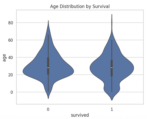
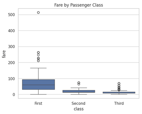
7. Feature Relationships (Boxplots, Violin, etc.)
Analyzing feature relationships helps us understand how numerical variables differ across categorical groups. Visual tools like boxplots and violin plots provide a clear view of distributions, central tendencies, and outliers.
# Age Distribution by Survival
sns.violinplot(x='survived', y='age', data=df)
plt.title("Age Distribution by Survival")
plt.show()

# Fare by Class
sns.boxplot(x='class', y='fare', data=df)
plt.title("Fare by Passenger Class")
plt.show()
Examining age across survival groups or fare across passenger classes can reveal patterns that might influence outcomes, offering valuable insights for predictive modeling or deeper exploratory analysis.


Conclusion
Exploratory Data Analysis is more than just a preliminary step — it's the foundation of any meaningful data science project. Through statistical summaries and visual exploration, EDA uncovers hidden patterns, highlights data quality issues, and guides the choices you make in feature engineering and modeling.
By applying techniques like univariate and bivariate analysis, correlation heatmaps, and distribution plots, we’ve seen how a dataset can start to tell its story. In our Titanic dataset example, we observed the role of gender and class in survival rates, identified outliers in fare prices, and got a feel for the overall structure of the data.
As you move forward to model building or advanced analytics, remember: the insights you gather during EDA can make or break your results. Let the data speak — and listen carefully in this crucial phase.


